March 13, 2024
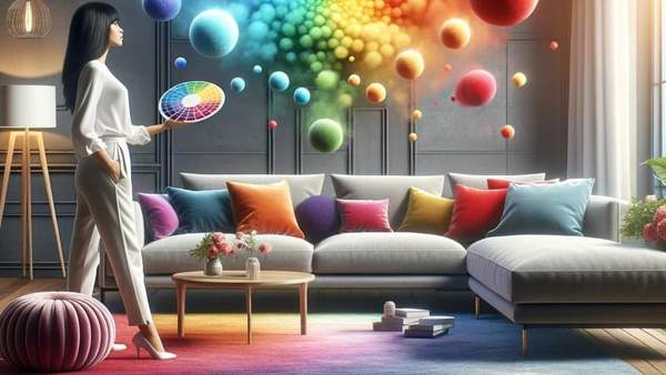
Welcome to our guide on mastering the magic of the colour wheel!
This blog post will explore the fascinating world of colour theory and its application in design and decor.
Whether you're a seasoned designer looking to refresh your knowledge or a beginner eager to learn the basics, this guide is your go-to resource for understanding and leveraging the power of the colour wheel.

As we embark on this journey, we'll explore the fundamental principles of the colour wheel, from its origins dating back to Sir Isaac Newton's groundbreaking experiments to its modern-day applications in interior decorating and design.
Throughout the post, we'll uncover the significance of primary colours, the dynamic interplay of complementary colour combinations, and the art of creating harmonious colour schemes.
Join us as we unlock the secrets of the colour wheel and discover how to use its principles to transform your spaces with vibrant hues and captivating designs.
Whether you're embarking on a new decorating project or seeking inspiration for your next masterpiece, this guide will equip you with the knowledge and tools to create visually stunning and harmonious environments.
Let's dive in and explore the magic of the colour wheel together!
This section will explore its foundational role in design and decor and unveil its power as a visual tool for creating harmonious colour combinations.
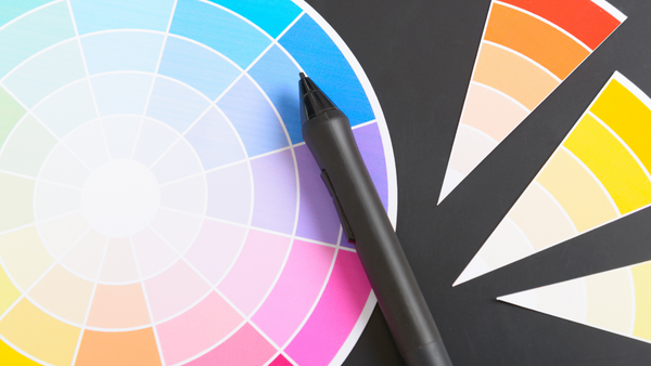
The colour wheel is not merely a circular diagram of hues; it is a fundamental tool that organises colours based on their relationships with one another.
Hues refer to the pure, basic colours found on the colour wheel. They are the simplest form of colour, without any added tint or shade. Hues are typically represented by primary colours (red, blue, and yellow) and are the building blocks for all other colours.
Originating from Sir Isaac Newton's experiments with light and colour in the 17th century, the colour wheel has evolved into an essential component of design theory.
One of the colour wheel's primary functions is to categorise hues into primary, secondary, and tertiary colours.
Primary colours, including red, blue, and yellow, are the building blocks for all other colours on the wheel.
Secondary colours are created by mixing primary colours, while tertiary colours result from mixing primary and secondary colours together.
The colour wheel visually demonstrates the relationships between colours, such as complementary, analogous, and triadic combinations.
Complementary colours, positioned opposite each other on the wheel, create dynamic contrast when paired.
Analogous colours, located adjacent to each other, create a sense of harmony and cohesion.
Triadic colour schemes utilise three colours evenly spaced around the wheel to create a balanced and vibrant palette.
Over time, the colour wheel has become a cornerstone of design and decor, influencing everything from art and fashion to interior decorating and graphic design.
Its principles have been embraced by designers and decorators worldwide, serving as a guide for creating visually appealing and harmonious compositions.
In this section, we've uncovered the foundational role of the colour wheel in design and decor. From its origins to its modern-day applications, the colour wheel continues to shape the way we approach colour in our creative endeavours.
In this section, we'll delve into the significance of primary colours and their role as the foundation of the colour wheel.
Primary colours - red, blue, and yellow - are the cornerstone of the colour wheel. They are pure colours that cannot be created by mixing other colours together. Instead, they serve as the basis for all other colours on the wheel, acting as essential building blocks for creating vibrant and dynamic colour palettes.
Primary colours are crucial in creating secondary and tertiary colours.
When primary colours are mixed together, they produce secondary colours such as green, purple, and orange. These secondary colours then serve as the basis for tertiary colours, which are created by mixing primary and secondary colours.
Understanding the significance of primary colours is essential for designers and decorators alike. They provide a starting point for creating colour schemes and help establish a space's overall mood and aesthetic.
Whether you're painting a room, selecting furniture, or choosing decor accessories, primary colours are a guiding force in the design process.
Primary colours also have a psychological impact on the viewer. Red is often associated with energy and passion, blue with calmness and serenity, and yellow with happiness and optimism.
By understanding the psychological effects of primary colours, designers can evoke specific emotions and create meaningful experiences within a space.
In this section, we've explored the significance of primary colours and their role as the foundation of the colour wheel. From their purity to their psychological impact, primary colours are essential elements in design and decor.

In this section, we'll explore the dynamic interplay of complementary colours and how they can create visual impact in your designs.
Complementary colours are pairs of colours opposite each other on the colour wheel. Examples of complementary colour pairs include red and green, blue and orange, and yellow and purple.
When used together, complementary colours create a vibrant contrast that can enhance the visual appeal of your designs.
One of the key characteristics of complementary colours is their ability to create visual contrast. When placed side by side, complementary colours intensify each other, making them appear more vibrant and dynamic.
This contrast can draw the viewer's eye and create focal points within a design.
While complementary colours create contrast, they also have the potential to create balance and harmony when used thoughtfully. By incorporating complementary colours in your designs, you can achieve a sense of equilibrium that enhances the overall aesthetic appeal of a space.
Complementary colour combinations are commonly used in various design disciplines, including interior decorating, graphic design, and fashion.
In interior decorating, for example, designers often use complementary colours to create bold accent walls or striking colour schemes that make a statement.
In this section, we've explored the dynamic interplay of complementary colours and their ability to create visual impact in your designs. From intensifying contrast to achieving balance and harmony, complementary colours offer endless possibilities for creative expression.
In this section, we'll explore the art of creating harmonious colour schemes and achieving balance in your designs.
Colour schemes refer to the combination of colours used in a design or decor project. There are various types of colour schemes derived from the colour wheel, including monochromatic, analogous, and triadic schemes.
Each type of colour scheme has its own unique visual effects and can evoke different moods and emotions.
Monochromatic colour schemes consist of shades and tints of a single colour. This creates a harmonious and cohesive look that is easy on the eyes. Monochromatic schemes are versatile and can be used to create both subtle and bold designs.
Analogous colour schemes consist of colours adjacent to each other on the colour wheel. These schemes create a sense of harmony and flow, making them ideal for creating cohesive and balanced designs. Analogous schemes are often used in nature-inspired or tranquil spaces.
Triadic colour schemes consist of three colours evenly spaced around the colour wheel. These vibrant and dynamic schemes create a sense of balance and visual interest. Triadic schemes can be bold and energetic or soft and harmonious, depending on the colours chosen.
Regardless of your chosen colour scheme, achieving balance and harmony is essential in design. Balance refers to the distribution of visual weight in a design, while harmony refers to the overall sense of unity and cohesion.
You can create a harmonious and visually pleasing space by balancing colours, textures, and proportions.
This section explored creating harmonious colour schemes and achieving balance in your designs. Whether you prefer monochromatic elegance, analogous tranquillity, or triadic vibrancy, every aesthetic has a colour scheme.

In this section, we'll explore practical tips for applying the principles of the colour wheel in interior decorating.
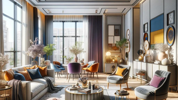
When choosing paint colours for your interior space, consider using the colour wheel to create harmonious colour schemes. For example, you can use analogous colours for a calming effect in bedrooms or triadic colours for a bold statement in living rooms.
Experiment with different shades and tones to find the perfect balance for your space.
The colour wheel can also guide your choices when selecting furniture and decor accessories. Look for pieces that complement the colour scheme of your room, either by matching existing colours or providing a contrasting accent.
Incorporate textures and patterns to add depth and visual interest to your design.
Consider the flow of colour throughout your space to create a cohesive and visually pleasing environment. Use the colour wheel to determine how colours interact from room to room, ensuring a harmonious transition between spaces.
Pay attention to sightlines and focal points to create a sense of continuity and balance.
Accents and finishing touches are crucial in tying your interior design together. Use the colour wheel to select accent colours that complement your main colour scheme and add pops of colour throughout your space.
Consider incorporating artwork, throw pillows, rugs, and other accessories to enhance the overall aesthetic.
Ultimately, interior decorating is a personal expression of style and taste. While the colour wheel can provide guidance, don't be afraid to trust your instincts and incorporate colours that resonate with you.
Your home should reflect your personality and make you feel comfortable and happy.
In this section, we've explored practical tips for applying the principles of the colour wheel in interior decorating. From selecting paint colours to choosing furniture and decor, the colour wheel offers endless possibilities for creating beautiful and harmonious spaces.
Conclusion
As we conclude our journey through the magic of the colour wheel, we've uncovered the foundational principles, explored dynamic colour combinations, and learned practical tips for applying these concepts in design and decor.
From the significance of primary colours to the art of creating harmonious colour schemes, the colour wheel is a powerful tool for designers and decorators alike.
By understanding the relationships between colours and harnessing the principles of the colour wheel, you can transform your spaces with vibrant hues and captivating designs.
Whether you're embarking on a new decorating project or seeking inspiration for your next masterpiece, the colour wheel offers endless possibilities for creative expression.
As you continue your design journey, remember to trust your instincts and let your creativity shine. Experiment with different colour combinations, textures, and patterns to create a space that reflects your personality and style.
We hope this guide has inspired you to embrace the magic of the colour wheel and unlock the full potential of colour in your designs. Now, it's time to put your newfound knowledge into practice and bring your vision to life!
If you're ready to take the next step in your design journey, we invite you to subscribe to our newsletter for exclusive tips, trends, and inspiration to help you transform your space. Join our community of design enthusiasts and unleash your creativity with the magic of the colour wheel!
Thank you for joining us on this journey. Until next time, happy decorating!
A1: The colour wheel is a foundational tool for organising colours and understanding their relationships, guiding designers and decorators in creating harmonious colour schemes and visually appealing compositions.
A2: Primary colours (red, blue, and yellow) are pure colours that cannot be created by mixing other colours. They serve as the basis for all other colours on the wheel, acting as essential building blocks for creating vibrant and dynamic colour palettes.
A3: Complementary colours are pairs of colours opposite each other on the colour wheel, such as red and green or blue and orange. Complementary colours create a vibrant contrast that enhances visual appeal and creates focal points within a design.
A4: To create a harmonious colour scheme, consider using colour schemes derived from the colour wheel, such as monochromatic, analogous, or triadic schemes. Experiment with different combinations of colours and textures to achieve balance and cohesion in your design.
A5: Accents and finishing touches add personality and depth to your interior design. Use the colour wheel to select accent colours that complement your main colour scheme and incorporate accessories such as artwork, throw pillows, and rugs to enhance the overall aesthetic of your space.
A6: Start by familiarising yourself with the basic principles of the colour wheel, such as primary, secondary, and tertiary colours, as well as complementary and analogous colour combinations. Then, experiment with different colour schemes and combinations to find what works best for your space and personal style.
A7: Inspiration for colour schemes and design ideas, from nature and art to fashion and architecture, can be found everywhere. Take cues from your surroundings, explore design blogs and magazines, and don't be afraid to experiment and make the design your own.
A Guide To Creating Seamless Indoor-Outdoor Living Spaces
Elevate Your Bedroom Style: 7 Tips and Tricks for Personalization
Designing Your Dream Space: Tips for a Contemporary Living Room
Comments will be approved before showing up.
May 09, 2026
The rooms that feel warm and restorative usually have something else going on beneath the surface. Softer lighting. Better texture. Less visual tension. A sense that the space supports the way you actually live in it — reading at night, slowing down after work, having somewhere your body can fully settle. That’s why so many beautifully styled homes still feel uncomfortable. They’ve been designed visually, but not sensorially.
May 07, 2026
Too many cushions on a sofa can quietly make a living room feel more cluttered, less relaxing, and physically uncomfortable. This article explores how excess styling affects posture, emotional ease, and everyday comfort — and why creating a truly comfortable home often starts with removing more, not adding more.
May 03, 2026
A cosy living room isn’t created through decor alone—it’s designed through how the space supports your body, senses, and time. Discover how layout, lighting, and subtle environmental details shape a room you can truly relax in for hours. Learn how to make your living room cosy and relaxing in a way that actually lasts.

